
SOD in R
Implementing the SOD algorithm as an extension to R makes it both easy to
install and to use the R environment for suitable data pre-processing and for
displaying the results. This is particularly useful when dealing with data derived
from global gene expression studies where the starting dimensionality is extremely
high and it is not feasible to remove all dimensions in a gradual manner.
This page contains basic instructions for both installing and running SOD within
an R environment.
Installing SOD
Prerequisites
What is needed to install SOD depends on whether you wish to compile the latest
version from source or whether you want to install a precompiled version.
This package has as of 2014-07-04 been published on
CRAN (the Comprehensive R archive network)
and can easily be installed from within R. The latest source code can be found
at gitorious.
At the very minimum a working R installation is required. Download links
and installation instructions are available from
CRAN.
After starting R you should be able to simply type:
install.packages("SOD")
from within an R session, and everything should magically work. Let me
know if it doesn't. On Linux the install.packages
command usually compiles the binary from source whereas on Macs and Windows
binary packages will usually be installed. To force a source compilation you
can use the type:
install.packages("SOD", type="source")
Alternatively the source code can be downloaded from
CRAN and installed from
the command line :
R CMD INSTALL SOD
where SOD is either the name of the directory of
the expanded tarball, or the name of the tarball itself. Doing it this way
allows you to inspect the complete source code.
Installing the latest source from gitorious
To install from source you need to have a full compilation tool chain set
up on your computer. In the Linux world this is fairly normal, but more unusual
on Macs or Windows machines. On Macs (i.e. OSX) you can install the X-code
integrated development environment which used to contain everything you would
need. However, with recent versions of OSX you need to seperately install the
command line tools. What is needed to get those tools seems to change fairly
rapidly, so you'll need to check with Apple. For Windows machines, the situation
is rather more complex, and I don't know how that should be done. However all
answers can be had from Google.
I keep the latest version of the source code at
gitorious. Follow the
'Repositories', 'r-sod' link on the right hand side of the screen to find
the latest version.
The source code tree can be downloaded either as an archive (also
known as a tarball) using the download link (right hand side), or the
full git repository can be cloned using git. To see the command required
to clone the git repository click the question mark next to the address
box at the top of the page. The command is likely to be:
git clone git@gitorious.org:r-sod/r-sod.git
Using git is convenient, as you get the full version history, and it makes
it possible to update the source code with a single command. However, in order
to clone from gitorious, it seems that you need to set up an account, so
it may be simpler to download the tarball.
If you've downloaded the tarball, you'll get a file with a very long name
called something like, 'r-sod-r-sod.......tar.gz'. Use the 'tar' program
to decompress and unarchive the file.
tar zxvf r-sod-r-sod........tar.gz
This will create a directory called 'r-sod-r-sod' containing the full
source code for both the R functions and documentation.
If you've obtained the source by cloning the repository, you'll end up with
a directory called 'r-sod' instead. Just substitute in the following commands.
At this point installing the
package should be a simple case of:
R CMD INSTALL r-sod-r-sod
However, as these are my development directories, it is probably safer
to do the following (at least if you're on Linux or OSX, if you're using
Windows none of this is likely to work):
cd r-sod-r-sod
./cleanup
cd ..
R CMD INSTALL r-sod-r-sod
This will make sure that you remove any files that R doesn't like to
see in the installation, but which I keep around for future reference.
I've tried this on several Linux and Mac OSX systems, and it has also been
done on a Windows machine without any problems. However, there's a good chance
that something is different on your machine. If so and you run into problems,
please let me know.
Running the package examples
Start an R session, and type:
library(SOD)
or
require(SOD)
The latter only loads the library if it hasn't already been loaded, whereas the
former will reload it. Probably the latter is better.
To access the help menus, as usual do:
?SOD
## and the links in the 'See Also'
?DimSqueezer
?hsv.scale
## etc..
The package comes with a data set called 'f186'. This can be loaded using:
data(f186)
As described in help sections. To find out more about this data, simply do as
usual ?f186. To run the example analysis simply do:
data(f186)
m <- as.matrix(f186[,7:12])
ds1 <- DimSqueezer$new(m)
sq1 <- ds1$squeeze(2, 1000)
The first of these commands data(f186) simply loads
the f186 dataframe into the current environment.
m <- as.matrix(f186[,7:12]) creates a numerical matrix
from colums 7:12 of the f186 dataframe.
Each row of m gives the coordinates of a point in N-dimensional
space. In most experimental data, each row represents an object (a cell in the example data)
and each column provides a numerical descriptor. Hence, each object (or point, or node) is
described by N (the number of columns) values and this description can be thought of as a
point in an N-dimensional phase space.
ds1 <- DimSqueezer$new(m) creates a new DimSqueezer object
called ds1 using the data in matrix m and
sq1 <- ds1$squeeze(2, 1000) calls the squeeze function on this
object and assigns the result to sq1.
The squeeze function gradually reduces the dimensionality of the phase space to
the target dimensionality (2 in this case). This
results in a decrease in the distances between objects, and the differences
between distances in the squeezed and original phase spaces are used to calculate
a force vector at each point. The objects are then moved using these force vectors in order
to decrease the error (i.e. stress) in the set of object distances before the
dimensionality is reduced further. This procedure is then repeated (iterated) for the
specified number of iterations (1000 in this time) to produce an M (the target number, 2)
dimensional representation of the data.
(Well, that's a slight over-simplification,
see further down for details.)
Plotting the results
The squeeze() function returns a named list. This is a type
of R data structure that contains a number of elements that can be accessed either via
a numerical index (i.e. it's an ordered list) or via names. The list returned by the
squeeze() function contains 5 elements:
- stress: The sum of inter-node errors at each iteration
- mapDims: The effective dimensionality at each iteration
- pos: The final node positions after mapping
- time: Some timing information (empty for now)
- node_stress: The amount of error at each node
Each individual element of the list can be accessed by name or position. e.g. The stress
element can be accessed by sq1[[1]], sq1$stress
or sq1[['stress']]. (R lists are a little bit funny in that you need to
to use the double subscript operator [[ ]] rather than the usual
[ ] to access the elements of the list.)
Plotting the stress
The SOD package provides a small number of functions that can be used to visualise the result of
the mapping process. To see how the stress (i.e. total error) changed during the process do:
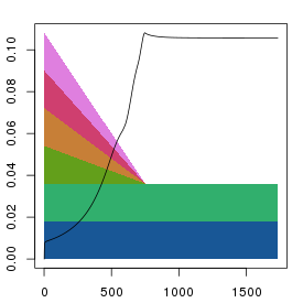
plt.stress(sq1)
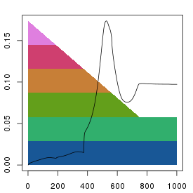
This should produce something looking like:
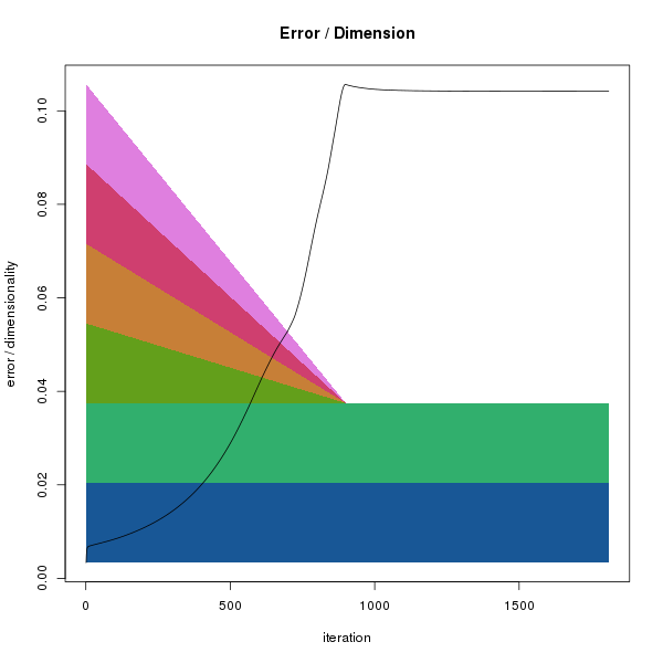
Reduction of dimensions and stress evolution. The x-axis indicates
the iteration number. The background polygons show the decrease in
dimensionality during the mapping process. Each colour indicates a single
dimension. At the start (left), all dimensions are complete, but as
the squeezing proceeds the effect of dimensions 4-6 on distances is reduced
in parallel. By iteration 750, only dimensions 1 and 2 remain. As the
dimensions are reduced the error in the system grows (black points).
Note that although we specified 1000 iterations when calling
ds1$squeeze(2, 1000) the x-axis extends to
about 1750 iterations. This is because the squeezing algorithm keeps
iterating until no further decrease in error is observed (i.e. a local
minima is reached) or the total number of iterations exceeds 3 times
the specified number. This behaviour can be changed by calling
ds1$residual(FALSE).
Plotting points
The package provides two functions for plotting the points after
the mapping procedure.
- plt.points()
- plt.concentric()
Both functions take a list as returned by the various
squeeze() functions and a number of optional
arguments that modify how the plot looks.
Both are fairly simple convenience functions that serve more as examples
of how the data can be displayed than as definitive methods. To see the
code that implements the functions, just type the name of the function
without the brackets or arguments:
> plt.points
function (sq, col = hsv.scale(sq$node_stress), x = 1, y = 2,
    invert.y = FALSE, xlab = NA, ylab = NA, ...)
{
    xv = sq$pos[, x]
    yv = sq$pos[, y]
    if (invert.y)
        yv = -yv
    plot(xv, yv, col = col, bg = col, xlab = xlab, ylab = ylab,
        ...)
}
From the function definition we can see that plt.points()
simply plots a scatterplot of the first two columns of the
pos element of the sq
list (when we call the function using plt.points(sq1)
the sq1 object will be copied
and referred to as sq witin the function).
The colours of the points (given by the col
argument) defaults to hsv.scale(sq$node_stress). That is
to say that the colour of each point is determined by the values in the
node_stress element.
The hsv.scale() function takes a vector (i.e.
a list, but in R, list has a special meaning) of numbers and returns a
vector of colours representing the respective values of the input vector
(with low to high values represented by a blue-cyan-green-yellow-red-purple
range of colours). Hence:
plt.points(sq1)
results in:
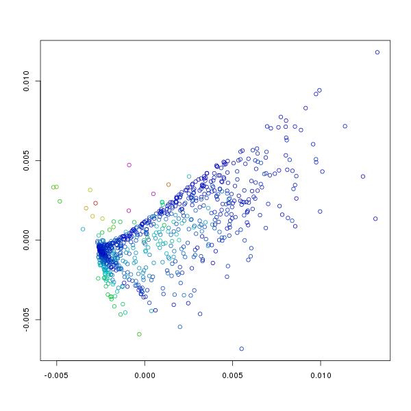
Points represented in 2 dimensions. Axis are arbitrary as the resulting
representation is not really cartesian. The colour of each point indicates
the amount of error or stress at the point (i.e. the sum of the differences
between distances between it and other points in the original N-dimensional
space and the final 2-dimensional space). Blue indicates low error, purple
maximal errors with intermediate errors represented by cyan-green-yellow-red.
The default plot isn't particularly interesting, though it does give some
information as to which points have found appropriate positions, and which
points do not fit with the overall pattern. To visualise the patterns
within the points we can use different colouring schemes where the colours
can represent anything we like. To begin with it makes sense to see how
the position in the 2 dimensional field relates to the initial N-dimensional
values (i.e. those in f186[,7:12]). Note that the
data in the columns of f186 can also be accessed through their names
and that this was done for the following plots.
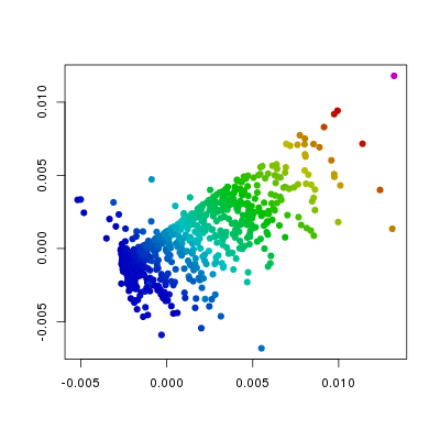
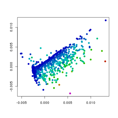
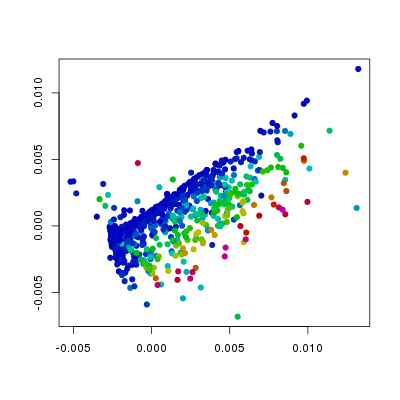
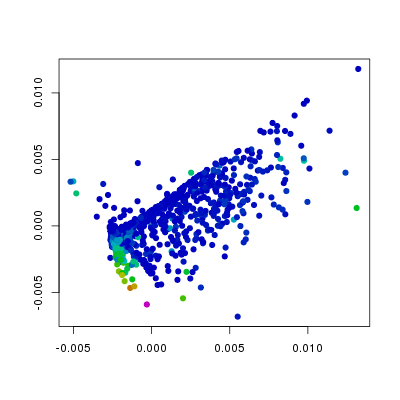
plt.points(sq1, pch=19,
    col=hsv.scale(f186[,'Etv2']))
plt.points(sq1, pch=19,
    col=hsv.scale(f186[,'Flk1']))
plt.points(sq1, pch=19,
    col=hsv.scale(f186[,'Fli1']))
plt.points(sq1, pch=19,
    col=hsv.scale(f186[,'Pdgfra']))
In the above plots I have changed the col
and the pch arguments from the defaults. The
col argument is set such that the colour
indicates values in the different columns of f186,
whereas the pch argument has been changed
from the default 1 (open circles) to 19 (filled circles). From this we can
see that the levels of Etv2 have the biggest influence on the position of
points, and that the variation in Fli1 and Flk1 levels is orthogonal to
that of Etv2. Furthermore, we can see, as we would expect that Pdgfra is
expressed in a relatively small population of cells that do not express Etv2.
The package also provides the plt.concentric
function. This allows you to visualise how an arbitrary number of variables
relate to position in the plot (how many really depends on the nature
of the data and how good your colour-vision is).

plt.concentric(sq1, f186[,7:12],
               leg.pos='topleft', cex.max=5)
Each point is represented by a series of concentric discs
where the areas of the non-overlapping parts (i.e. the visible parts)
are proportional to the values in the columns specified by the second argument
of the plot function. See the online documentation for more details.
Specifying the dimension factors
Since it's not clear if there is an optimal strategy for removing
dimensions during the mapping process the package also provides a
function (squeezeDF) that takes as an argument
a matrix of dimension factors. Each row of the dimension factors table
represents the
dimensionality at the ith iteration with the columns
representing each dimension. Values should be between 0-1, with 1 representing
a full dimension, and 0 a completely eliminated one. These matrices
may be specified in any way, but three functions are provided.
- parallel.dim.factors()
- parallel.exp.dim.factors()
- serial.dim.factors()
Each function takes as its arguments the starting dimensionality,
the total iteration number and a set of
optional parameters (see documentation). Unless otherwise specified the methods
assume a target dimensionality of two.
As a picture speaks a thousand words,
perhaps the following code and plots will suffice to explain.
df1 <- parallel.dim.factors(6, 1000)
df2 <- parallel.exp.dim.factors(6, 1000)
df3 <- serial.dim.factors(6, 1000)

## ds1 was created in code further up on the page
sq1 <- ds1$squeezeDF(df1)
sq2 <- ds1$squeezeDF(df2)
sq3 <- ds1$squeezeDF(df3)
plt.stress(sq1)
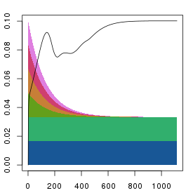
plt.stress(sq2)
plt.stress(sq2)
All methods give fairly similar arrangements and errors when the
iteration numbers are reasonably high, and it's unclear as to what the
preferred method should be. The parallel reduction is the default as it
its results should be less influenced by the order of the columns. However
the serial method gives a nice indication of the number of dimensions needed
to fully represent the data.
In the above example, the original data describes a reasonably large number
of points in a small number of dimensions (6). For such data it is feasible
to start the squeezing process with the points in their original positions and
to gradually remove the dimensions. However, when the starting dimensionality is
very high, as for microarray or RNA-seq data (one dimension per gene, i.e. ~22000)
this is clearly not going to be a reasonable strategy to follow. For such
data it is possible to simply specify a reasonably small starting dimensionality
and use the squeezeDF() function. That will give rise to
very high errors in the early iterations, but the method usually gives something
reasonable. However, a much better way to achieve the result is to first perform
a principal components analysis (PCA), and then to perform the SOD transformation
on the PCA transformed points (see below). In fact, this is probably the most
correct way to perform the analysis and using R makes it extremely simple.
openCL acceleration
The SOD method is computationally intensive, and doesn't really scale that well
as large numbers of iterations where distances of all against all points have
to be calculated need to be performed. That is to say that the execution time
scales to the square of the number of points. However, for technical reasons, the
number of iterations required is also related to the number of points and, hence
the complexity of the method scales to the cube of the number of points. That's
not particularly good, and hence I was surprised to find that the method works
both rather faster and better than other comparable MDS algorithms. Nevertheless,
anything that makes it go faster is good.
The methods available through objects of the DimSqueezer
class make use of parallel processing on multiple cores or processors using
openMP. This works very well where it is supported, but unfortunately, recent
versions of Mac OSX do not support openMP (technically it is the default compiler,
clang, that doesn't support openMP) and this can have quite a major effect depending
on the processor present. In order to provide higher performance I also implemented
methods that can make use of general purpose graphical processing units (GP-GPU)
through the use of openCL. This
can provide drastic increases in processing speed, though whether or not it
does will depend on how well the problem fits the specific GPU present. The openCL
functions can be accessed through the DimSqueezer_CL
class.
The DimSqueezer_CL class is constructed in the same
way as the DimSqueezer class by giving it a matrix
of positions. It's functionality is currently limited to one function,
squeeze() that requires one additional argument
that determines the local work group size. The meaning of this argument is not
that clear, but it is related to how parallelised the work load ends up being.
To use simply:
## where m is a matrix of positions described above
ds2 <- DimSqueezer_CL$new(m)
## this prints out a load of information describing your
## graphics card if you have one.
sq2 <- ds2$squeeze(2, 1000, 64)

## where the extra parameter, 64 is the local work group size
openCL is not necessarily available on all computers as both appropriate
hardware and an appropriate development environment are required. Hence, it
is by default not present on Windows installations, and I can not control
whether or not it is made available on other pre-compiled installations. If you're
interested in it, then you will probably need to compile code yourself.
Rather more worrying I've found that the openCL code can freeze the display
on some Macs when specifying a local work group size larger than the recommended
multiple work group size. I don't know why that should be the case, but in any
case these functions should be used with care.
PCA pre-processing
When the starting data represents points in very high dimensional space
as in the case of high-throughput gene expression data (usually ~20,000
dimensions) it is not feasible to gradually remove all of these dimensions.
However, this problem can simply be overcome by first performing a
principal components analysis (PCA) of the data. The PCA can be thought of
as a simple rotation of the data that maximises the amount of information
present in the lower dimensions. In the PCA the original set of data is
multiplied by a rotation matrix that results in a set of points with a
reduced dimensionality when the number of dimensions is larger than the
number of objects described. If for example we have M samples described
in N dimensions and M is smaller than N, then the result of the matrix
multiplication will be a set of M points described in M dimensions. Since
the transformation is a rigid rotation the inter-node distances are
identical to those in the original data and the transformed positions
can be used in the SOD analysis.
In an R environment it is trivial to combine the analyses using
the prcomp() function. For example, given a set of
gene expression data gxd that we want to analyse,
typically we would do:
pc <- prcomp( t(gxd) )
## t(gxd) swaps the rows and columns of the original data
## this is usually required for gene expression data as it
## tends to have genes in rows and samples in columns. As we
## want to (usually) compare the samples we need to first
## transform the data.

ds1 <- DimSqueezer$new(pc$x)
## the prcomp function returns a named list
## with the transformed points in $x.
## In this case each row of $x represents a single sample

sq1 <- ds1$squeeze(2, 1000)

## or alternatively we may want to specify the dimfactors
df1 <- parallel.dim.factors(12, 1000)
sq1 <- ds1$squeezeDF(df1)
This works very well, and it is arguable that the SOD analysis should
always be preceded by a PCA. (Both for performance and correctness, but
in practice it probably doesn't make that much of a difference most of
the time.)
This page still under construction. Updates may occur.