Genes are represented on Affymetrix microarrays by a number of probes grouped into probe-sets. Each probe set contains a number of pairs of probes (the MGU74 series used 16 pairs, the newer MOE430 series use 11) with each pair having one probe with perfect complementarity to the target sequence and one probe containing a single base mismatch. Since the two members of a pair of probes are located next to each other, and as hybridisation is carried out under conditions which should only allow perfectly complementary targets to hybridise to the target, the mismatch probe is considered as a good background control. In addition individual probe pairs of a probe set are distributed across the area of the chip decreasing the overall effects of localised artefacts. Although it has been suggested that it is better to ignore the mismatch control, most analyses use the individual probe pair differences to calculate an aggregate expression value by some means. Our programs tend to not bother to calculate absolute expression values (although it is possible) but rather to provide an easy means for viewing the expression data for individual probe pairs.
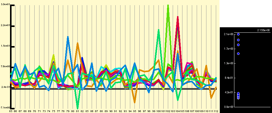
The raw data window allows the viewer to view the raw probe pair differences across the experimental series, both in their raw form and after a simple transformation. This data is shown as a line graph, with the different samples denoted on the the x-axis, probe pair difference on the y-axis with each line representing an individual probe pair (see below).
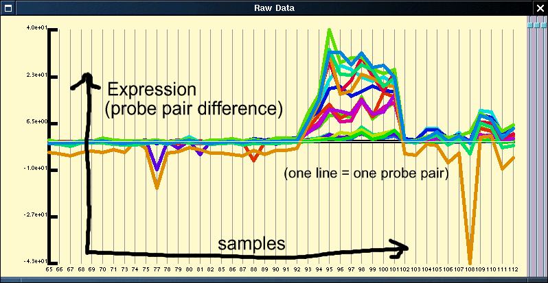
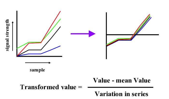
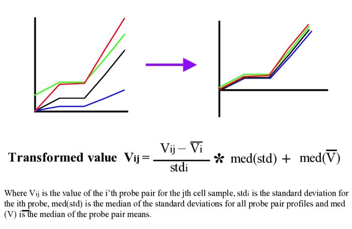
As can be seen from figure 1, in general most probe pairs show the same pattern of change across an experimental series; however, there is a wide range of response rates for individual probes and each probe pair appears to have its own distinct background signal which can be either positive or negative. In order to visualise expression patterns more easily the individual probe pair profiles can be normalised across the experimental series. Although it is perhaps most common to apply a log based normalisation for the data given that we have values which are both close to 0 and below 0 this is not advisable. We instead use a variation of the normal z-score normalisation (see figures below) which sets the mean to 0 and variance to 1 for individual members. As the normal z-score normalisation loses all amplitude information we instead set the variance and the mean to the median of the probe pair variances and the median of the probe pair means respectively.
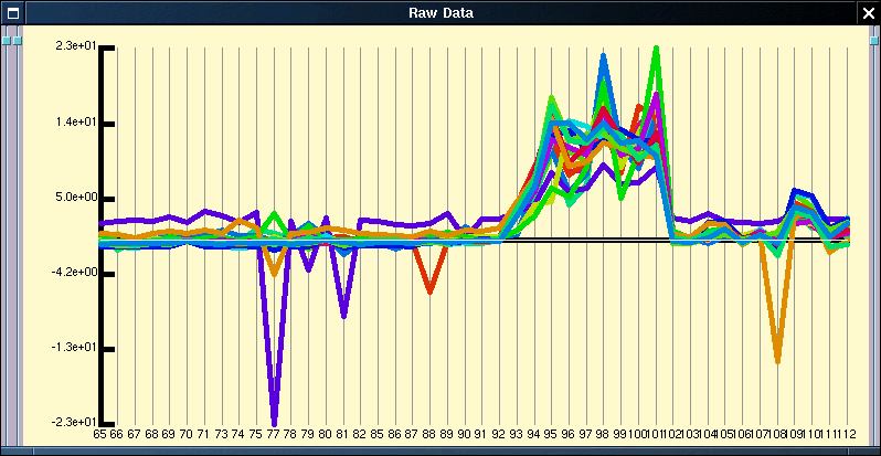
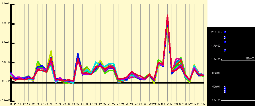
Application of the quantitative normalisation to the expression profile shown in figure 1 results in the below figure. In this case the normalisation does not really clarify the expression profile, but it is commonly the case that the expression pattern from badly performing probe sets or for genes expressed at a low level are obvious after normalisation but hidden before.
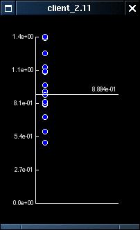
The normalisation of the individual probe pair profiles makes it trivial to provide a simple filter which removes the probe pair profiles which do not conform to the overall pattren of expression. This filtering can be controlled by right-clicking on the expression plot and selecting the 'Probe Correlations' menu option. This opens a small window which plots the correlation of the individual probe pair profiles along the y-axis. Right-clicking on this graph toggles a selector line which can be dragged up and down using the left mouse button. This changes the threshold value used in the filtering from the default level of 1 (technical details elsewhere).
The effect of the filtering can be seen most easily with data for the Sox-11 gene, where a small number of probe pairs do not appear to respond to their target though the majority do
Right clicking on raw data window also allows the user to copy the graph to the clip-board, to
toggle up a 2-d surface plot or to change the font used. The surface plot is an experimental
feature which won't be described in detail here as it is likely to change, for those interested
however, I suggest reading the sections concerned with comparing samples to
each other.
Perhaps the most useful menu option is the 'Clone Plot Window' option. This
allows you to open an additional raw data window whose sample selection can be
indpendently manipulated (say to show data from only a specific array type or
a subset of the whole data set). This is very useful when you have large data
sets, or when you wish to perform statistical operations on different sample sets.
The window which displays the expression patterns contains two panels which can be resized in the horizontal dimension by sliding the separating widgets. The first of these panels displays the raw probe pair data, the second shows the quantitatively normalised data.
If you are dealing with a large data set derived from many samples, and especially if these have been derived using different types of arrays it is useful to open a number of different raw data windows with individual sample selections, eg. one for each chip type, or individual ones for the subset of the data that you are more interested in (see the sample selector description for how to create different sample selections).