Experiment Compare (comparisons of samples)
One obvious application of the expression data is to determine the
relative similarities of different cell types. There are a number of
ways in which this can be done, the most common perhaps being some form
of hierarchial clustering based on some sort of distance or correlation
measurement. More recently this has been achieved mostly by principal
components type algorithms that can be used to reduce the innate
dimensionality of a given phase space (if my description is factually
incorrect, then feel free to let me know; this is not my specialty).
This program provides a slightly different mechanism for achieving
this. First, all against all distances between the currently selected samples are calculated using
either a direct or a modified euclidean distance (using a soft thresholding). These
distances are then mapped to a 2 dimensional field using a simple error minimisation
algorithm. The distances are calculated by the server (as the server has the expression
data in memory), but the mapping to two dimensions are carried out by the client application.
To compare the samples to each other it is advisable to follow the following procedure.
- Select the set of experiments (samples) which you want to map using the
Samples window
- Select a set of probe sets with high quality data which you want to include in the comparison by
pressing the 'Stat Collection' button in the main window and using the stat window to select probe sets.
Alternatively, one can restrict one's comparison to certain classes of genes by initially performing
a database lookup for probe sets representing genes of those classes.
- Open the 'Experiment Compare' window by pressing the 'Compare Expts' button and specify the
comparison (as described below).
- Start the 2d mapping process and enjoy the view on the screen, and play around a bit.
The experiment Compare Window
The experiment compare window lets the user perform two types of comparisons. One uses euclidean
distances based on the expression data, whereas the other maps the data between 0 and 1 using
a sigmoidal function (thus creating a sort of soft thresholding). The second of these seems to
result in better groupings of samples, though it is not entirely clear why this is. It should be
emphasised that these methods are quite simple, and that there are many ways of improving the
calculated distances and if people are interested in doing this then let me know and we can
discuss the issues that need to be tackled and how to implemement it in code (actually quite simple).
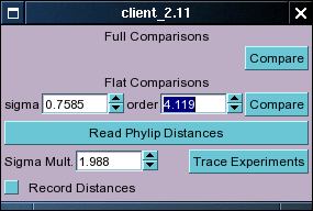
For the flat comparison there are two parameters that can be changed, one the order of the sigmoid
function and sigma, a value which changes the width of the function (I don't remember exactly off hand,
but this may be described in more detail at later stages). Press the top 'Compare' button to start
a normal comparison and the lower 'Compare' button to start a flattened comparison. A new widget
will be inserted into the window when the comparison is finished. This contains controls for the
process of mapping the points to a two-dimensional field using the distances obtained in the comparison.
The bottom of the Compare Experiments window also contains some buttons and stuff labelled
'Trace Experiments'. This is just something that I was playing around with, and in general I would
suggest that you ignore this as it doesn't appear to do anything particularly useful at the moment.
Artefacts of some thought-experiments. I like to keep it there in case I think of a way of fixing
the functions.
There is also a function that allows you to read in distances between things (can be anything)
created by external programs (in a specified file format). This button is labelled 'Read Phylip Distances'
as I used this a few times to display distances between proteins calculated by the Phylip suite of
programs. I don't remember off hand what the requirements for the input file are, but if you're
interested let me know or check the source code.
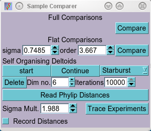
The Experiment Compare Window with a 'Self Organising Deltoid' widget
The comparison functions return a set of all-against-all distances between samples. These need to
be displayed in some meaningful manner. This program uses a simple error minimisation algorithm
that I've termed 'Self Organising Deltoids' in the absence of a better name (this algorithm may have
been described elsewhere, but I haven't seen it.. if you have please let me know, so that I can use
the proper name). This algorithm works by first assigning random positions to the samples in a 2-D field,
then comparing the distances between samples represented in two dimensions to he distances obtained by
comparing the expression patterns. If two samples are too close to each other (i.e. closer than the
measurement obtained from the expression data) then a repulsive force is applied to the sample, if they
are too far apart, then an attractive force is calculated. The program calculates all-against all forces
in this manner, and then moves the sample points. This is carried out in an iterative manner until some
criteria is met. Currently the program doesn't try to guess when to stop, but rather just runs 500
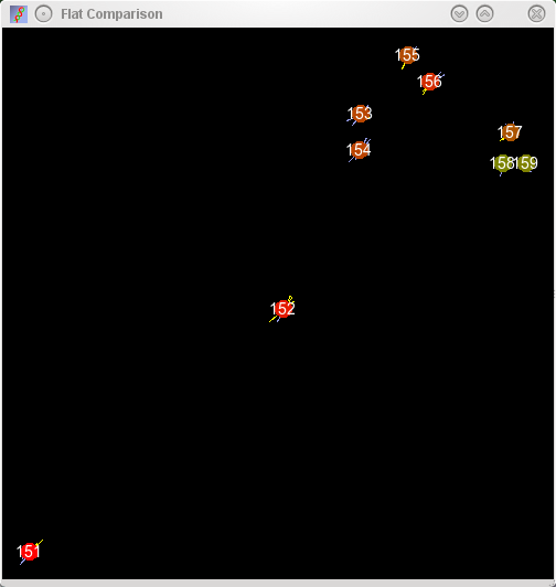
iterations or so. The resulting forces and movements are displayed in a window that opens when the
distances are returned. Samples in this window are represented with blobs (with sample numbers superimposed)
with the repulsive and attractive forces that the blob is subjected to being displayed by yellow and
blue lines respectively. Naturally this algorithm does not usually find an optimal arrangment, and the
blobs are colour coded to indicate the amount of stress they are under (green minimal stress, red maximal
stress).
At present time the above described algorithm has been replaced by a somewhat smarter
more complicated method. As should be obvious, the above description maps
samples in an (N-1) dimensional space to coordinates in a a 2 dimensional
space; and this reduction happens at the beginning of the mapping
procedure when samples are assigned to random positions in a 2D field. Equally
obvious should be the fact that there is nothing special about a 2D field
except for the fact that the monitor is intrinsically a 2D display medium (one
can also argue that vision is essentially 2D as we are not blessed with X-ray
vision); hence the algorithm can be used to map into any number of
dimensions. Since optimal arrangements are much more likely to be found in
higher dimensional space I've changed the method, such that the initial
dimensionality can be specified (Dim no.), and this dimensionality is then
gradually reduced to two by one of three methods:
-
Starburst: Dimensions are reduced suddenly from n to n-1 (eg. 4 to 5)
during the mapping process. I refer to this as starburst as sample blobs burst
with attractors and repulsor lines when exposed to a sudden decrease in the
available dimensions.
-
Serial: Dimensions are reduced serially, as in Starburst, but they are
squeezed gradually such that there are no sudden decreases in dimensionality.
-
Parallel: All Dimensions except for two base dimensions are squeezed in
parallel until the space is purely two dimensional.
There isn't that much difference in how well these different squeezing methods
work, though to be honest, I can think of no rational argument for keeping the
starburst one (it's just kind of pretty). The advantage of the serial method
is that it essentially tells you the innate dimensionality of the system (this
can be inferred from the stress plotter window). Intuitively the parallel
method makes the most amount of sense to me, but that's not terribly
objective.
Sample Map examples
 |
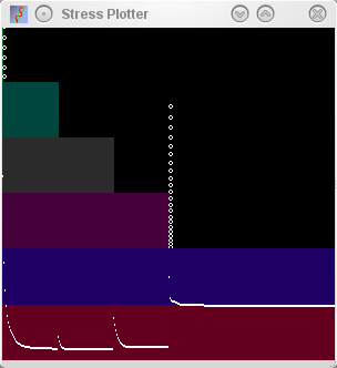
Starburst Note how there is a sudden spike when dimensions
are reduced from the mapping procedure. |
 |
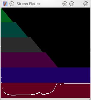
Serial Note how a low stress is found very rapidly at the
start of the mapping procedure, and how this remains low until the
third dimension is squeezed out of existence. |
 |
Parallel Boring smooth increase of stress seen at the end when
the additional dimensions are squeezed out. |
|
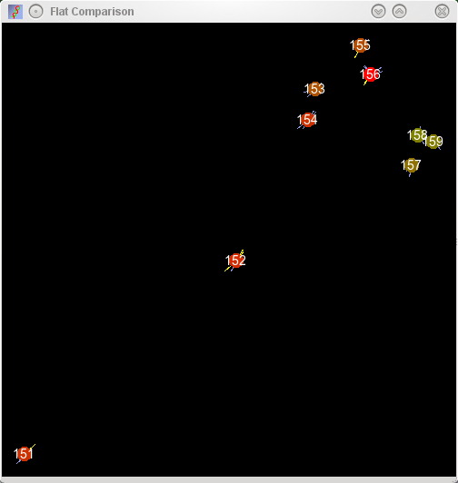
Maps of a set of MSC like cells derived from ES cells or embryonic
tissues mapped into 2D space by sample relationships defined from 520
probe sets. Left column shows the map of the samples, right column shows
the stress plot displayed during the plot. As can be seen from the
serial plot (middle row), the relationships between these samples can be more
accurately described in 3 dimensions (note the increase in stress as the
third dimension is squeezed out), however, the errors in the placement
of the sample identifiers is small as displayed by the small size of
attractors and repulsors.
|
To start the transformation procedure, select the starting dimensionality, and
the number of iterations to use (the larger the number of dimensions, the
larger number of iterations should be used as these are split evenly across
the dimensonalities), and press the start button in the 'new widget' shown in the
above figure. Unless your computer is really slow just select the maximum
number of iterations (10,000 at the moment, but I'm planning to increase
this) and see how things go. Try with different number of dimensions and
different reduction algorithms to see the effect. If you wish to have a
record of the mapping procedure, you can right-click on the "Comparison"
window and select Record on/off. This will prompt you for a directory
location that will be filled with lots of Jpgs of the process. Let the
mapping procedure finish before you try to doother things within the program
(the actual mapping procedure runs in a separate thread, but the interacting
drawing makes it difficult to use the program for other things during the
mapping procedure. The procedure is finished when the blobs stop moving
(or at least the forces stop changing). If there are many samples, then it
is possible for samples to get caught in inappropriate areas by the repulsion of intermediate samples. If this
happens, the caught samples will have very long yellow attractive lines pointing to other samples. The
program allows you to drag these to a new position in the map and then to view the resulting forces
and to continue the mapping procedure again (press 'Continue'). It is also possible to restart the
mapping procedure from a different random seed by pressing the 'start'
button again.
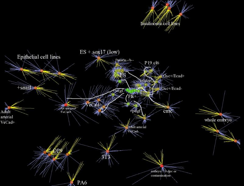
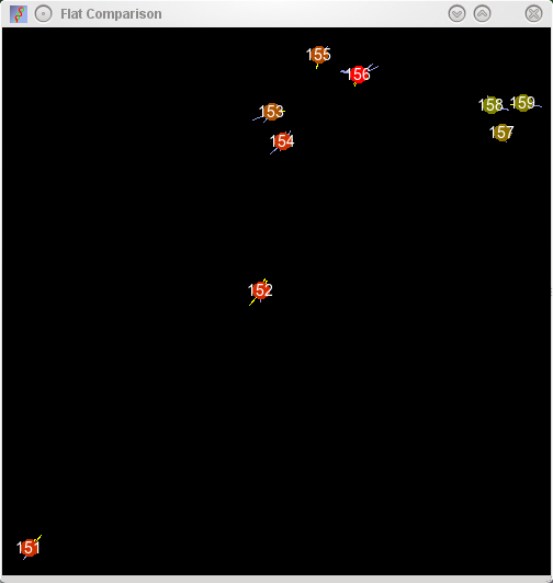
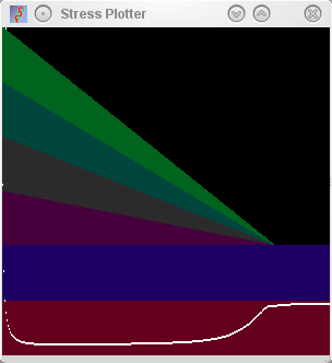
Sample relationships for a database of expression containing ES derived mesodermal
derivatives in addition to a number of terminally differentiated cell types
In addition to moving single points around the area you can also select two groups of samples
by drawing a region around those samples. The selected samples will be displayed in a different
colour, indicating group membership. Actually this selection is just a interface element at the moment,
but the idea is that it should be possible to ask questions of grouped samples (i.e. what's different
between these samples and these samples). One of the obvious things to do for the future, but
implementing the righh interfaces and choosing good statistical functions is not completely
trivial.
There is a contextual menu that can be accessed by right-clicking on the drawing area. This menu
only has two entries at the moment, one 'Compare Cell Types' doesn't do anything. The second entry,
'Set Coordinates', is related to the 'Toggle Surface Plot' of the raw data expression plot window.
I'll leave it to the user to work out how to use these functions (they are anyway more examples
of thought experiments than solidly useful functions).